What makes an award-winning website? Is content more important than graphics, or is a splashy visual design the determining factor for acquiring accolades? To provide an empirical basis for answers to these and related questions, we examined the Webby Awards 2000 dataset to understand which factors distinguish highly-rated websites from those that receive poor ratings. For these awards, the websites were categorized into 27 topical categories such as Science, Arts, Commerce, Living, and News, and expert judges were recruited for each of these topic areas. The websites, numbering nearly 3000, were rated according to six criteria: content, structure & navigation, visual design, functionality, interactivity, and overall experience.
We found that, across the dataset, the content criterion was by far the best predictor of the overall experience criterion, while the visual design criterion was the worst predictor of the overall experience. Analysis of ratings within the 27 topical categories showed that the importance of the five criteria to the overall experience score differed substantially among the topics. For example, in the Arts category, the visual design criterion and the content criterion were equally important, whereas in the Activism category, content was very important, but visual design was not important for predicting the score for overall experience.
The importance of content and the relative lack of importance of visual design was mirrored in layperson’s ratings of the websites (known as the People’s Voice ratings). Websites with the highest ratings as determined by peoples' votes were those that rated lower in visual design and higher in content by the Webby Awards judges.
An oft-debated question in website design circles is the relative importance of content versus graphics. The increasing popularity of Flash animation is fanning the flames of this conflict [Nielsen00a]. There are many guidelines for the design of websites [Nielsen00b, Borges96]. However, these guidelines offer conflicting views of which dimensions are important for website design; a recent survey of 21 web guidelines found little consistency among them [Ratner96]. We suspect this might result from the fact that there is a lack of empirical validation for such guidelines. To provide an empirical basis to the underlying debate, we examined the Webby Awards 2000 dataset to understand which factors distinguish highly-rated websites from those that receive lower scores.
These websites, numbering nearly 3000, were rated according to six criteria: content, structure & navigation, visual design, functionality, interactivity, and overall experience. We were able to extract several interesting findings from this dataset. Most prominently, we were able to show that across the dataset, the content criterion was by far the best predictor of the overall experience score, while the visual design criterion was the worst predictor. We were also able to show that the when websites are categorized according to general topic, this effects which criteria are most important for predicting the overall experience.
This work is part of our larger efforts to provide empirical foundations for web site usability analysis [Ivory et al. 00, Ivory et al. 01]. These papers offer evidence that page-level metrics, such as those concerning page composition (e.g., word count, link count, graphic count), page formatting (e.g., link clusters, text clusters), and overall page characteristics (e.g., page size, download speed) can predict if a website was rated highly or not according to Webby Awards judges and other rating systems. By contrast, this paper examines the characteristics of the Webby Awards ratings themselves.
The next section describes the procedure by which the Webby Awards were determined. The following two sections discuss the analysis of the ratings, first across all websites, and then within website topic categories. We then discuss the sites that were nominated in more than one category. We conclude with a discussion of the potential implications of this work.
The Webby Awards dataset is a unique resource, as it is the largest (as far as we know) collection of websites rated along one set of criteria. For the Webby Awards 2000, an initial pool of 2909 sites was rated on overall site experience as well as five more specific criteria.
Judging takes place in three stages: Review, Nominating, and Final. (Only the list of nominees for the Final round is made available to the public.) Anyone can nominate any site to the Review Stage provided the site in question meets the following conditions: (i) the site fits into one of the 27 topic categories. (ii) the site is open to the general public (i.e., not password protected) (iii) site usage is free, at least for a trial period. [1] For Webby Awards 2000, nearly 3000 websites were nominated for the Review stage. An order of magnitude fewer sites were recommended to the Nominating stage; 414 made this round in our dataset. (The Review judges can nominate additional sites that did not appear in the first round for evaluation during this stage.) In the Final stage, five candidates per topic category, for a total of 135 sites, are nominated. From these candidates, judges select one winner for each topic category. Multiple judges (typically three) review each site during each of the three stages.
A panel of over 100 judges from The International Academy of Digital Arts & Sciences selects winning sites. The criteria for judge selection differed at each of the three reviewing stages. Below we describe the criteria for judges for the first two stages (Review and Nominating stages) since our analysis is focused on these two.
· Review Stage Judges: Webby Awards organizers state the judge selection criteria for the Review Stage as follows: ``Site Reviewers are Internet professionals who work with and on the Internet. They have clearly demonstrable familiarity with the category in which they review and have been individually required to produce evidence of such expertise. The site reviewers are given different sites in their category for review and they are all prohibited from reviewing any site with which they have any personal or professional affiliation. The Academy regularly inspects the work of each reviewer for fairness and accuracy.''
· Nominating Stage Judges: Webby Awards organizers state the judge selection criteria for the Nominating Stage as follows: ``Nominating judges are new media journalists and editors, web developers, and other Internet professionals who possess comprehensive knowledge of the range of sites that fall within their area of expertise. They are generally active in the online communities within their category and dialed into the spectrum of Web sites therein.''
· People’s Voice Ratings: The 135 websites assessed by judges in the Final Stage were also evaluated by the public in what is known as the People's Voice Awards. Anyone on the Internet could vote for his or her favorite site within each category. [2]
The Six Rating Criteria: Webby judges were asked to rate sites on overall experience as well as five more specific criteria:
· Content: ``Content is the information provided on the site. Good Content should be engaging, relevant, and appropriate for the audience-you can tell it's been developed for the Web because it's clear and concise and it works in the medium. Good Content takes a stand. It has a voice, a point of view. It may be informative, useful, or funny but it always leaves you wanting more.''
· Structure & Navigation: ``Structure and Navigation refers to the organization of information on the site and the method in which you move through sections. Sites with good structure and Navigation are consistent and effective. They allow you to form a mental model of the information provided, where to find things, and what to expect. Good Navigation gets you where you want to go quickly and offers easy access to the breadth and depth of the site's Content.”
· Visual Design: ``Visual Design is the appearance of the site. It's more than just a pretty homepage and it doesn't have to be cutting edge or trendy. Good Visual Design is high quality, appropriate, and relevant for the audience and the message it is supporting. It communicates a visual experience and may even take your breath away.”
· Functionality: ``Functionality is the use of technology on the site. Good Functionality means the site loads quickly has live links, and any new technology used is functional and relevant for the intended audience. The site should work cross-platform and be browser independent. Good Functionality is technology you can't see.”
· Interactivity: ``Interactivity is the way that a site allows the user to do something. Good Interactivity is more than a few little sound effects and a Flash animation. It allows the user to give and receive. It’s input/output, as in searches, chat rooms, e-commerce and gaming. Interactive elements should project the distinct feeling that the user isn’t reading a magazine or watching TV anymore.”
· Overall Experience: The Overall experience encompasses Content, structure and Navigation, Visual Design, Functionality, and Interactivity, but it also encompasses the intangibles that make one stay or leave. It's like a date-just the user and the site-sometimes it clicks and sometimes it doesn't. One has probably had a good Overall experience if she places a bookmark, emails the site to a friend, or stays for a while, intrigued.”
We employed several statistical techniques, such as correlation coefficients, independent sample t-tests, and linear regression to answer the following questions.
· What criteria were most important for determining award-winning websites?
· Were there differences within topic categories?
The following sections summarize our findings.
In order to gain an understanding of the criteria for award winning websites, it is important to analyze both good and bad websites. We can be somewhat confident that we are sampling from the whole range of website quality (and not just good websites) at the initial stage, because the ratings for the Review Stage span the entire range of judging scale (from 1-10) (see Figure 1a). On visual examination, the distribution approaches a normal distribution. Most websites fall in the middle range, some are rated very positively and some are rated very negatively. The distribution is somewhat positively skewed, with a longer negative tail.
Figure 1b shows that the distribution for the Nominating Stage is strongly positively skewed. The mean for the Review Stage is lower (6) than that for the Nominating Stage (mean 7.7). These statistics show that the websites at the Nominating Stage were generally rated to be of higher quality than those at the Review Stage.
|
|
|
We also examined the frequency distributions for the five specific judging criteria (content, navigation, visual design, interactivity, and functionality) for the Review Stage. The plots looked similar to that for the Overall rating (unimodal distributions spanning the whole range, somewhat positively skewed).
As discussed above, the Webby judges are asked to rate the sites on five specific criteria and also on overall site experience. It may be the case that the overall site experience is an intangible quality not captured by the five specific criteria. To investigate to what degree the specific criteria capture the summary judgment, we computed correlations between overall ratings and ratings of specific criteria (see Table 1). In all cases, visual design has a lower correlation with the overall rating than the other criteria.
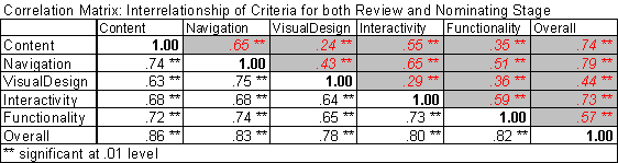
Table 1 -- Interrelationship of criteria for both Review
and Nominating Stage. Numbers below the diagonal (in the white background) show
the correlations for the Review Stage while the numbers above the diagonal
(shaded, in italics) show the correlations for the nominating stage.
Table1 shows that the criteria are not only highly correlated with the overall rating; they are also highly correlated with one another at both the Review and the Nominating stages. It also shows that correlations at the Review stage are stronger than those at the Nominating stage. (Note. Because of large sample sizes, the correlations are all significant at the .01 level). The high interrelationships among the criteria indicate that by and large, site quality criteria tend to rise and fall together. Sites that have good content scores also tend to be the ones with good navigation, interactivity, functionality, and (to a lesser extent) visual design. This hypothesis was also verified with a Principal Components Analysis that indicated that a single factor solution explained a large (81%) of the variance at the Review stage and a smaller (63 %) of the variance at the Nominating stage. As was expected, content had the highest loading onto this factor (i.e., it was highly correlated with the factor) while visual design had the lowest loading onto the factor at both the Review and Nominating stages.
We were also interested in examining the unique contribution of each criterion to overall site experience. For example, content ratings tended to covary with ratings of navigation, interactivity, etc. (see correlations between pairs of criteria in Table 1). To examine the unique contribution of content to the overall score, we recomputed the correlation between content and overall ratings, after extracting the common variance with other criteria (i.e., we statistically held constant all the other criteria, while examining the relationship between a specific criterion and overall rating). Figure 2 shows the correlations and partial correlations (i.e., unique relationship) for both the Review and Nominating Stages. Dark blue bars represent the correlation between overall rating and each specific criterion rating. Light blue bars represent partial correlations for the same pair of criteria. Partial correlations can be interpreted in the same way as correlations. (Note. Because of large sample sizes, all correlations and partial correlations are significant at the .01 level).
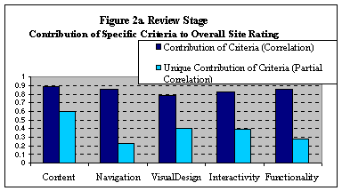
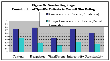
Figure 2a & 2b-- Correlations and partial correlations between overall ratings and ratings of specific criterion. Figure 2a shows relationships for the Review Stage, while Figure 2b shows relationships for the Nominating stage.
Review stage data shows that the most important criterion for predicting website quality was the content criterion. The correlation between content and overall rating was high and remained high even when the shared variance with other ratings was partialled out. The correlation between visual design and overall rating was lower as compared to the other correlations. The correlation with navigation and functionality drops down when variance of other ratings was partialled out. This indicates that the navigation and functionality do not make much unique contribution to overall ratings. This might be because all criteria are highly intercorrelated.
At the Nominating stage, content still displayed a strong relationship with overall rating, and the relationship remained high after the other criteria were partialled out. Navigation and Interactivity were highly correlated with overall criterion, but did not seem to make much unique contribution to overall rating. The interesting thing about the Nominating stage was the very low correlation between visual design and overall rating. Visual design shows a sharp drop in correlation from the Review to the Nominating stage. All other criteria show a high correlation with overall rating, even if the variance explained by them was not unique (indicated by the partial correlations). Visual design was the only criterion that did not seem to be important at the Nominating stage.
We asked another related question: taken together, are these criteria comprehensive? What percentage of variance in overall site experience do content, navigation, visual design, interactivity and functionality together explain at both the Review and Nominating stage? To answer this, a linear regression analysis was conducted to predict the overall rating from the five specific criteria across the whole sample. For the Review Stage, the linear combination of the five criteria accounted for 89% of the variance in the overall rating. (Adjusted R Square = .889, F = 13828.74, p< .000). The percentage of variance explained by the five criteria goes down in the Nominating Stage but still remains high. The five criteria explained 77% of the variance. (Adjusted R Square = .774, F=284.409, p < .001).
The definition of the overall site experience was left somewhat vague by the Webby organizers, as it represented the subjective experience of the site. As such, we were surprised to find that the five specific criteria overwhelmingly account for the overall site experience in the Review stage and to a lesser extent, in the Nominating stage. This finding is a validation of our quantitative approach to website quality since it suggests that a subjective site experience can be quantified in terms of more specific dimensions of Website quality such as content, navigation, etc., in a reliable way. As such, the five specific criteria identified by the Webby Awards might be a first step towards a empirical, multidimensional definition of website quality.
The five specific criteria explain a larger percentage of variance in the Review as compared to the Nominating stage. This finding suggests that there is a larger unknown component in judges' ratings at the Nominating stage. It is possible that judges at the Nominating stage were using some other criterion to make their assessments. There are a number of other differences between the Review and Nominating stages that might account for these differences. There were many more sites (2909 sites) in the Review stage as compared to the Nominating stage (414 sites). The sites in the Nominating stage comprised a higher quality subset of the Review stage (the ones with the highest ratings) and new sites (nominated by the judges). Hence, it is difficult to draw any strong conclusions regarding the differences between the Nominating and ReviewsStages.
Finally, we analyzed the People's Voice ratings
to compare them to judges’ ratings. We compared websites that were in the top
10% (in terms of the number of votes cast for each site) to websites in the
bottom 10%. Figure 3 shows the means for both of the groups. Sites that received
a large number of votes were generally higher on the criteria than sites that
got lower number of votes. To evaluate if these small differences were
significant, we conducted Independent Sample t-tests for each criterion. Each
t-test (results shown below) compared the websites that received the top and
bottom 10% of votes.
Thus the only criterion that distinguished websites that received a large number of votes from websites that received fewer votes was visual design. Interestingly, visual design was lower for sites in the top 10% than for sites in the bottom 10% of the Peoples' Voice votes. This apparently strange finding can be explained by examining the top 10% of sites, which were content-heavy and lacking focus on visual design (e.g., www.craigslist.com).
We conclude the following based on results in this section.
For the next set of analyses, we explored the relative importance of the five different criteria for the various topic categories. As mentioned above, the Webby Awards dataset comprised 27 topic categories (such as Arts, Commerce, and Community). For example: it can be hypothesized that the content criterion is more important for news sites than for Commerce sites, and that visual design is more important for Art sites than for Community sites. To explore this issue, we computed correlations between the overall rating and the specific criterion. We also employed linear regression analysis to predict the overall rating from a linear combination of the five specific criteria. From the above analysis, we identified profiles of categories in terms of the differential contribution of the five criteria. In the interest of space, we have chosen six categories (News, Commerce, Community, Arts, Personal, and Services) that represent some of the different category profiles that we discovered.
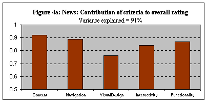
Webby Awards organizers described news sites as “Sites developed for the distribution of recent happenings. These may be offshoots of established news operations, or developed specifically for online news.” The site profile above shows that the most important criteria for News sites were content and navigation. Visual design lagged behind.
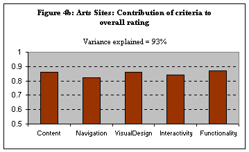
The Webby Awards organizers described arts sites as “Sites that display art, are art, are about art, or provide art criticism. These include online galleries, art projects, or portfolios.” The interesting thing about the profile of Art sites is that all of the criteria seem to play an equal role, including visual design. This is in stark contrast to other categories where the relative contribution of visual design was far below that of other criteria.
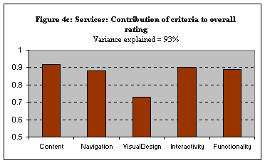
According to the Webby Awards organizers, Services sites are those that “allow real world activities to be done online. These include sites that help people find jobs, houses, dates, or which otherwise facilitate offline activities from the keyboard.” Since the primary purpose of Services sites is to allow people to get tasks done, it can be expected that content will play an important role. For example: an adequate job selection is a necessary feature of job selection sites. A second important feature of Services sites is the interactive element. To support the successful completion of tasks, the interactive element of a site assumes importance. As the site profile above shows, content ratings and interactivity ratings had the highest correlation with overall ratings.
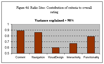
In contrast to Services sites, Radio sites need little or no interactivity. Webby Awards organizers describe these sites as: “Sites with ties to a radio station or program either on-the-air or on-the-Web. These include sites that relate to a specific show, segment, or station, either musical or talk-radio.” The site profile above shows that the overall rating of Radio sites was not affected much by visual design or interactivity.
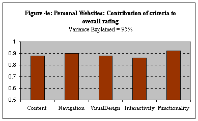
Personal websites are “sites about individuals. This includes sites by you about you, or sites by you about someone else (fan sites), or sites about you by a personally financed development team.” What features were important for the overall rating of personal websites? The profile above shows that all features were important for Personal websites, but most important was functionality. To understand this better, we examined the mean and variance for Personal websites as compared to mean and variance for the whole sample. As a group, Personal websites scored the lowest rating on all criteria. This suggests that functionality is a basic attribute that discriminated low scoring from high scoring sites. Another interesting aspect about this category is that navigation showed a larger correlation with overall ratings than content (in contrast to almost every other category where content has the highest relationship with overall rating). This suggests that the discriminating factor in Personal websites was navigation and basic functionality more than anything else.
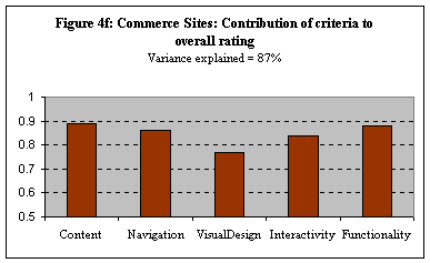
The Commerce category had the largest number of (309 sites compared to an average number of 107 sites for other categories). Webby Awards organizers describe Commerce sites as: “Sites developed with the primary purpose of selling goods or services online. Also includes sites that have a particularly innovative use of e-commerce but have another focus.” The site profile above shows that content played the largest role, followed by navigation and functionality. Visual design lagged behind. Another interesting thing about this category is that the percentage of variance explained is the second smallest of all of the categories. This indicates that compared to other categories, the five criteria explained a relatively lesser amount of variance. There are other important factors in the rating of Commerce sites that do not seem to be captured by content, navigation, visual design, interactivity or functionality.
Results presented in the previous section provide evidence that ratings differed within topic categories (i.e., some criteria were more important than others depending on the type of site). The main purpose of the next part of the analysis was to determine if the same sites were evaluated differently in different topic categories. 98 of the sites in the Review Stage were submitted for review in multiple categories (ranging from 2 to 5, mean of 2.7). These fall into 49 different category combinations with a mean of 2 sites per category combination. The dominant category combination was Community & Education with 13 sites submitted to both categories. Other frequently occurring category combinations were: Community & Living (6 sites); Community, Education & Kids (5 sites); Community & Health (5 sites); and Community & Services (5 sites). One site advanced to the Nominating stage in 2 categories (Community & Services); it was also submitted to both of these categories in the Review stage.
We asked the question: were sites submitted to multiple categories rated similarly in these different categories or were they rated differently? In other words, were the ratings on the various criteria context sensitive (i.e., dependent on the topic category the site was being judged in)? To answer these questions, we computed standard deviations for the ratings of the same site across multiple categories (higher standard deviations indicate greater differences across categories). We also computed the mean difference and maximum difference in ratings of same site across categories. Table 2 shows maximum difference and mean difference as well as the standard deviation for the 98 sites submitted to multiple categories. On average, a site's ratings vary by 1 unit between categories. The table shows that the content criteria varied the most (standard deviation of 0.75); this criterion also had the largest difference between scores (4.5). Thus the data once again suggests that content carries the most weight between categories. More importantly, it also suggests that the rating on the five content criteria is not absolute, but depends on the specific purpose. Therefore the content on the same site will be judged differently if it is a perceived as a community site than if it is perceived as an Educational site.
|
Table 2: Difference Between Ratings of Same Site in Different Categories | ||
|
Criterion |
Mean Difference |
Maximum Possible Difference |
|
Content |
1.0 |
4.5 |
|
Navigation |
0.9 |
2.9 |
|
Visual Design |
0.9 |
3.1 |
|
Interactivity |
1.1 |
2.7 |
|
Functionality |
1.0 |
3.1 |
|
Overall |
0.9 |
3.5 |
Table 3 presents the scores for an example site that demonstrates the importance of content as well as rating differences between categories. This site was submitted to both the Community and Education categories (the most common category combination) and exhibited the maximum difference (in terms of standard deviation) of 4.5 on the content score. Based on the overall rating, this site would be an above average community site, but a poor education site largely because of the content score.
|
Table 3: Difference Between Ratings in Different Categories for an Example Site | ||
|
Criterion |
Community |
Education |
|
Content |
8.0 |
1.7 |
|
Navigation |
6.3 |
3.0 |
|
Visual Design |
6.7 |
2.3 |
|
Interactivity |
5.0 |
1.7 |
|
Functionality |
7.7 |
3.3 |
|
Overall |
7.0 |
2.0 |
Much has been said about the importance of content versus graphics in website design. We presented concrete, empirical findings based on the Webby Awards 2000 dataset -- a large corpus of sites representative of the whole range of website quality. Several analyses demonstrated the role of content and graphics in the ratings of expert judges and in public votes:
Although content appears to be more important than graphics, the data also shows that no one rating criterion can be considered in isolation. The 5 specific criteria only explain 77% of the variance in overall ratings at the Nominating stage versus 89% in the Review stage; this indicates that there are factors beyond these 5 criteria that ultimately determine award-winning sites. Nonetheless, these findings suggest that there are opportunities for novel approaches to the development of web design guidelines that could help improve the quality of web sites. Our efforts to develop an empirical foundation for automated web usability analysis have demonstrated that quantitative metrics (capturing some aspects of the 5 specific criteria) can predict if a website has been rated highly or not by Webby Awards judges and other ratings.
We would like to gratefully acknowledge that this research was funded in part by an unrestricted Microsoft Research Grant and in part by a Hellman Faculty Fund grant. We would also like to thank the Webby Awards and the International Academy for Digital Arts and Sciences for allowing us to use the Webby Awards 2000 data for this study.
[1] For more details about the site submission process, see https://www.webbyawards.com/submit/rules.html.
[2] For more details about the judging process, see http://www.webbyawards.com/judging/process.html.
[Borges et al. 96] Jose A. Borges, Israel Morales and Nestor J. Rodriguez. Guidelines for Designing Usable World Wide Web Pages, in the Proceedings of ACM CHI 96 Conference on Human Factors in Computing Systems, conference companion, 277--278, 1996.
[Ivory et al. 01] Melody Ivory, Rashmi Sinha, and Marti Hearst. Empirically Validated Web Page Design Metrics, in the Proceedings of ACM CHI 01, Conference on Human Factors in Computing Systems, March 2001.
[Ivory et al. 00] Melody Ivory, Rashmi Sinha and Marti Hearst. Preliminary Findings on Quantitative Measures for Distinguishing Highly Rated Information-Centric Web Pages in the Proceedings of 6th Conference on Human Factors and the Web, Austin, Texas, 2000.
[Nielsen 00a] Jakob Nielsen. Designing Web Usability: The Practice of Simplicity, New Riders Publishing, Indianapolis, IN, 2000
[Nielsen 00b] Jakob Nielsen. Flash: 99% Bad. Alertbox, October 29, 2000. http://www.useit.com/alertbox/20001029.html
[Ratner 96] Julie Ratner, Eric M. Grose, Chris Forsythe. Characterization and Assessment of HTML Style Guides, in the Proceedings of ACM CHI 96 Conference on Human Factors in Computing Systems, Conference Companion, 115--116, 1996.