 |
Melody Y. Ivory
EECS Department
UC Berkeley
Berkeley, CA 94720-1776
ivory@cs.berkeley.edu
-
Rashmi R. Sinha
Psychology Department
UC Berkeley
Berkeley, CA 94720-5050
rrsinha@socrates.berkeley.edu
-
Marti A. Hearst
SIMS
UC Berkeley
Berkeley, CA 94720-4600
hearst@sims.berkeley.edu
We present preliminary findings of a quantitative analysis of several attributes of Web page layout and composition and their relation to usability. We compared Web sites that have been favorably rated by experts with those that have not been rated, and found that 6 out of 12 measured attributes were significantly associated with highly rated sites. We also found 2 pairwise correlations for highly rated sites, and 5 pairwise correlations for nonrated sites. Our predictions about how these pairwise correlations were manifested in the layout of the pages were supported by post-hoc inspect of randomly selected pages. Additionally, Web site home pages were found to have measurably different characteristics than other pages. These results will be used to inform further quantitative studies as well as user studies, the aim of which is to develop methods for automated usability assessment.
Despite the abundance of design recommendations, recipes and guidelines for building a usable Web site [4,5,6,15,16,17,18,21,22,24,25,26,27], usability, especially for information-centric Web sites, continues to be a pressing problem. Given that an estimated 90% of sites provide inadequate usability [20], a projected growth of 196 million new sites within the next five years [17], and a severe shortage of user interface professionals to ensure usable sites [17], tools and methodologies are needed to accelerate and improve the Web site design process.
Our research goal is to develop automated usability evaluation methods to enable designers of Web sites to compare alternative designs before undergoing costly implementation. We are creating a new methodology and tool called Web TANGO (Tool for Assessing NaviGation and information Organization). As part of this work, we plan to conduct user studies to determine values and thresholds for attributes of Web page composition that contribute to usability. In order to simplify the experiment design of the user studies, we would like to know which attributes are important and which can be eliminated from consideration. Thus as a first step, we are developing quantitative, automatic metrics to determine which attributes are correlated with usability.
This paper reports our preliminary analyses of a collection of over 400 information-centric Web pages. For this study, we place Web sites into two categories: ranked (that is, rated favorably by users or experts) and unranked (those that have not been so rated). For each Web page, we computed 12 quantitative measures having to do with page composition, layout, amount of information, and size (e.g., number of words, links, and colors). These metrics cover roughly half of the Web page attributes that have been ascribed to usability in the literature (see Appendix A). We found that 6 metrics - text cluster count, link count, page size, graphics count, color count and reading complexity - were significantly associated with rated sites. Additionally, we found 2 strong pairwise correlations for ranked sites, and 5 pairwise correlations for unranked sites. Our predictions about how the pairwise correlations were manifested in the layout of the rated and unrated sites' pages were supported by inspection of randomly selected pages. Home pages were found to have measurably different characteristics than other pages. Finally, we applied a linear discriminant classifier to the page types, achieving a predictive accuracy of 63%.
We are focusing on what we call information-centric Web sites - those whose goal is to convey information about some topic. Examples include news, government and medical information sites, as well as portals that provide content in addition to link indices. This is in contrast to Web sites whose primary goal is to perform a function or service. Some Web sites have both an information delivery portion as well as a functional section; online catalog sites are a good example of this type of site.
The next section discusses background information and related work. Section 3 describes the methodology, including the 12 quantitative metrics used and the Web page collection. The analysis of this collection is presented in Section 4, including the significant differences, metric correlations and the results of the predictive model. The paper concludes with discussion and future work.
Our survey of over 100 usability evaluation methods [12] revealed that several automated methods, such as operationalized guidelines and GOMS analysis, have been effective complements to non-automated methods like user testing. Despite the potential benefits, automated usability evaluation for human-computer interfaces is greatly underexplored, especially in the Web domain.
Most automated methods for Web sites focus on statistical analysis or visualization of usage patterns in server logs [2,3,7,10,11,29,30]. Server logs are problematic because they only track unique navigational events (e.g., do not capture use of back button) and are subject to obfuscations caused by caching.
Other automated, inspection-based approaches assess static HTML according to a number of guidelines, such as whether all graphics contain ALT attributes [1,23]. For example, the Web static analyzer tool (SAT) [23] checks the accessibility (i.e., support for users with disabilities), forms use, download speed, maintainability, navigation and readability of Web pages. Several aspects, such as adequate color contrast or functional scripts, are difficult to measure automatically with such tools. Other techniques compare quantitative Web page measures, such as the number of links or graphics, to thresholds [28,30,31]. However, concrete thresholds for a wider class of quantitative Web page measures still remain to be established; our work is a first step towards this end.
WebCriteria's Site Profile [32] attempts to mimic a user's information-seeking behavior within a model of an implemented site. Site Profile uses an idealized user model that follows an explicit, pre-specified navigation path through the site. It estimates page load and optimal navigation times for the path, and measures content freshness and page composition (e.g., amount of text and graphics). Currently, it does not employ additional user models, nor does it attempt to predict navigation paths, compare page composition to concrete thresholds or consider the impact of page attributes such as the number of fonts or colors.
Chi, Pirolli, and Pitkow [2] have developed a simulation approach for generating navigation paths for a site based on content similarity among pages, server log data, and linking structure. The simulation models a number of agents (i.e., hypothetical users) traversing the site from specified start pages, and it considers information scent (i.e., common keywords between an agent's goal and content on linked pages) to make navigation decisions. The authors use simulated paths as input to the Dome Tree visualization methodology, which enables the evaluator to explore commonly-traversed paths and gain insight about users' information needs. Similar to the WebCriteria approach, this method does not account for the impact of various page attributes, such as the amount of text or reading complexity, in its navigation decisions. Studies revealed that actual and simulated navigation paths can diverge dramatically when scent is not clearly visible (i.e., buried under graphics or text) [2].
Our methodology uses quantitative Web page attributes (e.g., number of fonts, images and words) to compare ranked and unranked Web pages. Specifically, we wanted to determine if there are significant differences between the groups and to construct a model for predicting group membership. This model would enable us to establish concrete thresholds for each metric, evaluate them with user studies, and eventually provide guidance for design improvement. The following sections introduce the metrics employed and describe the data collected for this analysis.
It is important to note that this study does not measure a key set of attributes - those relating to the quality and organization of the content itself. We recognize this limitation, and plan to address content-related issues as a separate problem. As noted above, some work has been done on information scent and determining content similarity between pages [2,8].
Appendix A lists 42 Web page attributes associated with effective design and usability. Table 1 describes the 12 metrics selected for our study. These metrics cover half of the attributes and can be computed automatically. We developed a tool to compute these metrics and capture additional information about Web pages, including degree of self-containment (i.e., whether the page encompasses all content and formatting or employs style sheets, scripts, applets or other objects).
|
We collected data for 463 information-centric sites from several sources (see Table 2). Between March 5 and 25 of 2000, we captured data for an average of 4 (maximum of 10) randomly-selected pages on each site, including the home page. The final data set consisted of 2,015 English and non-English pages, including pages from education, government, newspaper, magazine, financial, medical and portal sites. Some sites contained e-commerce components, but we removed such pages from our data set. We also eliminated pages with fewer than 30 words and only considered pages that exhibited high self-containment (i.e., did not use style sheets, applets, objects, scripts or frames). 1,054 of the pages (52%) fit our constraints.
We categorized pages as either ranked or unranked based on their source (Y or N in column 2 of Table 2). These sources base their ratings on either expert reviews or on user ratings of comparable top sites. Expert reviewers consider factors such as value to users, content and design quality, as well as popularity. For example, PC Magazine editors report that they spend considerable time analyzing the Web and subjectively selecting sites that they feel are ``useful and well-designed and deliver on the promises they make.'' The Webby Awards employs a panel of over 100 judges from The International Academy of Digital Arts & Sciences who use a rigorous evaluation process to select sites. Sources that employ user rating (The Web 100 and People's Voice Awards) also rely on expert reviewers to provide a list of top sites to users for final selection.
We consider these ranking sources to be more usability-centered and credible than other sources, such as RateItAll.com, which allows any user to arbitrarily rate any site on a 5-point scale (see Section 4.4). Finding a large sample of favorably ranked, high self-containment, information-centric pages proved to be a major challenge. It was even more challenging to find pages unfavorably ranked, since these sites are often redesigned in response to such ratings. As such, we are restricted to contrasting favorably ranked with unranked pages with the assumption that favorable ratings still apply (although those sites may have changed since the ratings took place). We do not assume a site to be unfavorably rated because it is unranked. We also assume that favorable rankings apply to all pages within a site, since experts typically evaluate a sample of pages.
The ranked sample consists of 214 pages, while the unranked sample contains 840 pages. From the unranked sample, we randomly selected 214 pages for this analysis. Hence, the analysis data comprises 428 pages (half ranked and half unranked).
We employed several statistical techniques, including t-tests for means, correlation coefficients, and linear regression, to study differences between the samples of ranked and unranked Web pages. Below we discuss these differences and in some instances offer anecdotally verified interpretations.
| ||||||||||||||||||||||||||||||||||||||||||||||||||||||||||||||||||||||||||||||||||||
Table 3 contrasts means and standard deviations for the groups and reveals several differences. We employed t-tests for equality of means to determine their significance and report 2-tailed p values in the table. Despite large standard deviations, there are significant differences (i.e., p < .05) for 6 metrics - text cluster count, link count, page size, graphics count, color count and reading complexity. We make the following inferences from the data in Table 3.
In our study, the mean reading complexity for ranked pages is 15.8, which is very close to the index for pages that facilitated information-seeking in the Spool et al. study. It is significantly different from the mean of 19.6 for unranked pages. We inspected representative unranked pages and found most to contain lists of links with very little non-link text. Currently, we compute the reading complexity for a page's text without considering how the text is formatted (e.g., in lists). Consequently, we can potentially underestimate the number of sentences for such formatting and hence overestimate the reading complexity. This is also the case for ranked pages that contain link indices similar to unranked pages. Contrary to unranked pages, most ranked pages containint numerous links tend to also contain link annotations as we will discuss in the next section. This layout results in an average reading complexity that is lower than the unranked sample. We plan to consider text formatting in computing our reading complexity measure in future studies.
We also computed product-moment correlation coefficients (i.e., ratios of covariance and variance) to study group differences for metric pairs. Table 4 summarizes key correlations for the samples. The following two subsections discuss the results for both ranked and unranked pages.
Coefficients for the ranked sample demonstrate large (i.e., |r| >0.5), positive correlations between link and text cluster counts as well as between font and color counts. This is also the case for the unranked sample, which we discuss in the next section. The first pattern coupled with negative correlations with emphasized body text percentage suggests that color is used mainly for display text. We observed that many documents use font tags to change the color of display text and/or situate display text in a colored region, such as a table row. Highlighting display text in this manner makes it stand out from body text and consequently facilitates scanning [18,26].
| ||||||||||||||||||||||||||||||||||||||||||||||||||||||||||||||||||||||||
Positive correlation between link and text cluster counts suggests that clustering is used to organize links into groups. The medium-strength correlation between color count and other attributes implies that color is used as a separator to a lesser degree than other techniques, such as lists, rules or link annotations (links coupled with descriptive text). Effective link clustering is thought to clearly expose the information organization, which in turn facilitates information seeking [21,22,27].
|
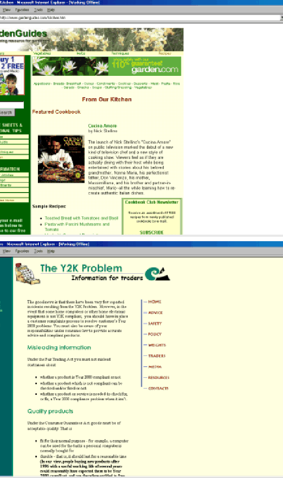
We inspected a random sample of 10 pages to see if pages exhibited predicted patterns - colored display text and link clustering. We observed both patterns on all pages, including the representative page from GardenGuides (http://www.gardenguides.com/kitchen.htm) shown at the top of Figure 1. First- and second-level display text is green and black (gray and black in grayscale) respectively. Links are clustered in the left column with a header and emphasized with reverse coloring. Links are clustered in the main text area in two ways: either a bordered region containing a green header and descriptive text; or a bulleted list with green text. Table 5 compares the page's key metrics to the group mean and standard deviation. They are fairly consistent with the group.
| ||||||||||||||||||||||||||||||||||||||||||||||||||||||||
Correlation coefficients for the unranked sample exhibit similar correlations between font and color counts and between link and cluster counts. However, they also exhibit strong, positive correlations between color and cluster counts, between color and link counts, and between graphic and link counts. Based on these additional correlations and correlations for emphasized body text percentage, we predicted that unranked pages would exhibit the following characteristics.
Strong correlations between color count and other metrics could imply that unranked pages use a larger number of colors than ranked pages. However, this is not the case; ranked pages use more distinct colors on average (mean of 8.6 vs. 7.4), a difference which was shown to be significant in the previous section. Instead, we hypothesize that these correlations illustrate a major difference in how color is used within the samples. For example, the unranked pages might contain more colored body text than the ranked pages, a point that is supported by the correlations between color count and emphasized body text percentage in unranked pages. We verified this hypothesis with a random sample of 10 pages from both groups. We also found ranked pages to contain more colored display text as previously discussed. Thus, highlighting body text - as opposed to display text - may be an overuse of color. In the extreme case of color overuse, non-emphasized text would stand out more than emphasized text [26], thus defeating the purpose of using emphasis indicators.
We inspected a random sample of 10 unranked pages for the three patterns: body text emphasis or clustering; link coloring or clustering; and images used for links. We observed at least two of these patterns in 70% of the sampled pages. The second example page in Figure 1 shows a representative page from the New Zealand Ministry of Consumer Affairs (http://www.consumer-ministry.govt.nz/y2k%20_traders.html). First- and second-level display text is green and brown (light and dark gray in grayscale) respectively. There are also several areas with consecutive lines of brown body text throughout the page. (Studies have shown that text emphasis spanning consecutive lines impedes readability [26].) Body text is interspersed with bulleted lists in several places. The left column contains links colored green, while the right column contains an arrangement of image links. Table 5 shows the page's key metrics to be fairly consistent with unranked pages as a group.
|
In the analysis above, t-tests revealed differences for individual metrics, while correlation coefficients enabled pairwise comparisons. We next employed linear regression to investigate relationships among metrics and to predict whether pages should be classified as ranked or unranked. We used a stepwise entry method on a subset of the 12 metrics where variables were entered into the analysis based on the mean difference between groups [13]. The metrics that were retained from this procedure were link count, text positioning count, color count, body text percentage, page size and reading complexity. Table 6 contains standardized coefficients for these metrics, which indicates their contribution to ranking predictions. Reading complexity, page size and body text percentage contribute roughly equally to predictions, while text positioning and color counts contribute about 1.5 times as much as these 3 measures. Link count contributes 2.3 times as much to predictions as the body text percentage, page size and reading complexity metrics. T-test results in Table 6 show these predictors to all be highly significant.
Equation 1 shows the regression equation expressed with unstandardized coefficients and a computed constant; it outputs a value near 0 to indicate an unranked page, and a value near 1 to indicate a ranked page. This equation explains 10% of the difference between the groups (p < .001) and has an F statistic of 4.369 (p< .001) indicating that the linear combination of these metrics is significantly related to the categorization of ranked versus unranked.
We also conducted a linear discriminant analysis to use the metrics to predict group membership. Similar to linear regression, we used a stepwise entry method on the full data collection [13]. We were able to successfully classify 63% of pages with the computed discriminant function; this function has a 98% correlation with Equation 1. The function was better at classifying unranked (71% correct) than ranked (56% correct) membership. Part of the difficulty lies in using rankings of 0 or 1 to distinguish groups, as opposed to a broader range of values. We intend to conduct user studies to collect Likert ratings in order to address this limitation.
A question that may be asked about our methodology is whether unranked pages should really be unranked, or whether they were simply overlooked and never assigned a rating. In order to indirectly assess this, we performed an additional study using a different set of ratings. These ratings are from RateItAll (www.rateitall.com), a site that enables any user to rate sites using a 5-point scale (1 - Terrible!, 2 - Bad, 3 - OK, 4 - Good, 5 - Great!). Unlike other ranking sources in our study, there are no rating criteria, and any person can rate any site. Thus the editorial authority of the ratings are subject to question, and the ratings might reflect subject matter and content as opposed to other elements of Web page design. Nevertheless, we decided to see if these ratings aligned with the ranked/unranked distinctions used above.
Nineteen sites in our original sample had been assigned ratings by at
least 4 people at RateItAll. This yields a sub-sample of 59 pages
(61% and 39% from ranked and unranked samples, respectively). The average rating for this sub-sample was 3.6 (i.e., better than OK).
We assigned rating scores as
low (
![]() ), medium (
2.2 < r < 3.8) and high (
), medium (
2.2 < r < 3.8) and high (
![]() ). 47% of the sub-sample belonged to the medium category and
53% to the high category. Sites tend to be rated favorably on
RateItAll, which accounts for the absence of pages in the low
category and the high average score for the sub-sample. We associated high ratings with ranked pages and medium
ratings with unranked pages1.
). 47% of the sub-sample belonged to the medium category and
53% to the high category. Sites tend to be rated favorably on
RateItAll, which accounts for the absence of pages in the low
category and the high average score for the sub-sample. We associated high ratings with ranked pages and medium
ratings with unranked pages1.
Comparing the two classification systems - ranked/unranked versus RateItAll's low/medium/high rating - revealed that 54% of pages were classified consistently (i.e., ranked with a high rating or unranked with a medium rating). Of the inconsistent assignments, 29% were ranked pages that were assigned a medium RateItAll score, and 17% were unranked with a high RateItAll score. The latter case (few unranked assigned a high rating) indicates that most of our unranked sample is properly labeled.
However, the former case in which ranked pages received a medium rating illustrates a difference between expert and user opinions, because 70% of these pages are from sources that employed expert review - WiseCat's Top 100, PC Magazine Top 100, and the Webby Awards. In an attempt to explain this difference, we ran the classifier on pages that had medium versus high RateItAll scores. The classifier achieved an overall accuracy of 70% using graphics count as the only distinguishing feature. As discussed in Section 4.1, ranked pages (i.e., high RateItAll score) contain more graphics than unranked pages. This difference between expert and non-expert ratings indicates that user studies using non-experts will have to be defined carefully.
We also separated the data into home pages and other pages. Our goal was to determine if our methodology was sensitive to a page's function, such as a home page, index page or content page [19]. Our analysis of home pages (58% ranked and 42% unranked) revealed some similarity to the analysis reported above; however, there were some major differences in metric correlations. For example, text cluster count predicts group membership for home pages with 66% accuracy, which is consistent with the primary goal of most home pages - giving the user an overview of site organization and contents. Analysis of non-home pages (48% ranked and 52% unranked) is almost identical to our prior analysis. However, link count, text positioning count, color count and reading complexity predict group membership with 63% accuracy. The model for all pages predicted group membership with the same accuracy and with these same metrics, but with the additions of body text percentage and page size. These results indicate that classifying pages by functional type or genre and incorporating this information into our analysis would improve accuracy. We plan to investigate this in future studies.
Web pages and sites differ from each other on many dimensions, such as layout quality, screen coverage and information quality. Many dimensions are not accessible to easy quantification and statistical analysis; however, this preliminary study demonstrates that quantitative measures can provide useful insight for distinguishing ranked and unranked information-centric pages. We identified 6 variables - link count, text positioning count, color count, body text percentage, page size and reading complexity - that predict group membership with 63% accuracy. We also illustrated key significant differences and usage patterns based on metric correlations. These studies in conjunction with our early findings should enable us to establish concrete thresholds for each metric, which could then be used by designers to improve Web site designs. Future work will focus on validating and improving our prediction model with user studies.
Currently our analysis focuses on single page metrics only. A natural extension is to study differences at the site level and evaluate consistency across pages. A more significant limitation in our analysis is that it currently covers only easily-quantified attributes. In the future we plan to develop measures that take into account information content, quality, and consistency.
Our approach is not meant to replace traditional evaluation methods, rather to complement these methods and ideally facilitate comparison of alternate designs before costly implementation and possibly reduce costs incurred with traditional methods.
For more information on Web TANGO or the metrics computation tool,
see
http://www.cs.berkeley.edu/![]() ivory/research/web.
ivory/research/web.
This research was sponsored in part by the Lucent Technologies Cooperative Research Fellowship Program, a GAANN fellowship and Kaiser Permanente. We thank Lincoln Stein for allowing us to use code from The Rating Game as a starting point. We also thank the anonymous reviewers for helping to improve our presentation of this material.
Table 7 provides a summary of 42 Web page aspects identified in the literature as influencing usability. We group these measures according to features they assess: text, link and image elements on a page (Page Composition); layout of elements on a page (Page Formatting); and high-level characteristics (Overall Page). Many characteristics in the first two groups can be easily measured, while most characteristics in the third group require designer and/or user evaluation. We note aspects measured by our metrics computation tool in column 3 (M) and provide references.
| ||||||||||||||||||||||||||||||||||||||||||||||||||||||||||||||||||||||||||||||||||||||||||||||||||||||||||||||||||||||||||||||||||||||||||||||||||||||||||||||||||||||||||||||||||||
This document was generated using the LaTeX2HTML translator Version 98.1p1 release (March 2nd, 1998)
Copyright © 1993, 1994, 1995, 1996, 1997, Nikos Drakos, Computer Based Learning Unit, University of Leeds.
The command line arguments were:
latex2html -split 0 hfw00.tex.
The translation was initiated by Marti Hearst on 2000-11-14